The “Writing for the Computer Industry” course has shown many techniques and values that are important when writing and designing for online content effectively. The course’s lessons will be used to analyze and criticize a tutorial to assess the effectiveness of a published tutorial for the sake of the class’s last assignment.
Prior to selecting a tutorial to critique, there were many information-filled documents that were reviewed before choosing the ‘SC847 CHASSIS SERIES USER’S MANUAL’ from SuperMicro. Reviewed manuals that were not selected include various computer hardware (motherboard manuals), music production software (Fruity Loops Studio 20), and website help guides (Twitch.tv). I chose the SC847 Chassis Manual because I am personally utilizing the user manual in my life and needed the manual to be useful for answering questions and guiding me as an end user.
I personally have found that the SC847 Chassis Manual is an incredibly effective and professional-grade guide that utilizes many techniques in design, content, and illustration that are sufficient for readers of all skill levels to follow and learn the information provided. The following write-up will be the analysis and discussion about what the manual does and does not do well to deliver information.
“People come for information that answers their question or helps them complete their task. They want that information to be easy to find, easy to understand, accurate, up to date, and credible.” (Redish 31)
PATHWAY PAGE
As a user, I am initially seeking some form of direction within the document to find the information that pertains to me. Immediately by the fourth page, readers are met with the “Manual Organization” section. This section of the manual lists all the chapters with their headings and a brief summary of the content and acts as a pathway page- helping readers scan content, select what is relevant to their interest, and move on.
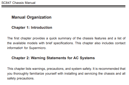
There’s a lot to take away from this specific section that acts as a baseline for how effective the rest of the document is. Headings are brief but offer a lot of context with concise wording and no bloat. As a user, this pathway page is beneficial in a long document like this (188 pages) as it reduces the obscurity of information and reinforces some structure to follow. As implied by the title of this section, the organization of this manual is displayed and briefs the user before getting into the details.
According to Redish (226), well-written headings in well-organized content help readers
• scan to get the gist
• find just the section they need
• follow the flow of your story
• get a quick “bite” of context for each section
• manage the amount they deal with at one time
which this section does with great clarity. SuperMicro provides an effective and efficient way for users to get acquainted with the document.
Redish has six points in regards to reader psychology when it comes to visiting websites or reading documents (143):
- Site visitors hunt first.
- People don’t want to read while hunting.
- A pathway page is like a table of contents.
- Sometimes, short descriptions help.
- Three clicks is a myth.
- Many people choose the first option.
In relation to the manual organization- a lot of these ideologies are satisfied. It is very easy for users to ‘hunt’ for the information they are seeking by utilizing this landing page. The amount of reading is kept to a minimum since “…we may read short descriptions. But we don’t want to read long, dense paragraphs” (Redish 143) when we are searching for information. The flow for ‘hunting’ isn’t held to a halt by inefficiencies of over-detailed descriptions.
The pathway page is like a table of contents but in this document, there is an actual table of contents (directly following Manual Organization) that directs readers to specific areas compared to briefing users on content.
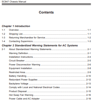
In regards to “Many people choose the first option”, there’s an implication that the most important information should be prioritized first as people will click what’s relevant immediately before finishing reading all the contents of a pathway page. The Chassis Manual’s chapter 2 “Warning Statements for AC Systems” listing warnings, precautions, and system safety is more important than chapter 6’s self-explanatory “Rack Installation” for instance.
CONTENT ORGANIZATION
In reference to the prior discussion about the Manual Organization/Pathway Page- a lot of the organization and structure is reflected throughout the content as a whole. There are four guidelines that Redish (158) has when breaking up and organizing content. They are
- Think “information,” not “document.”
- Divide your content thoughtfully.
- Consider how much to put on one web page.
- Use PDFs sparingly and only for good reasons.
The most important aspect that must be taken account for readers and writers is the first guideline in which Redish says “Most people come to the web for information, not for a complete document. They don’t want the manual; they want instructions for the task they are doing. They don’t want the handbook; they want the answer to a question. They want usable, manageable pieces” (Redish 158).
Nobody has the time nor the need, usually, to read an entire user manual in any scenario. This is why it is important to organize and create segments that will make accessing information easy and efficient through something like a pathway page or table of contents. The true purpose for guides, tutorials, and user manuals is to provide the information you seek- not all the information that is related to what you’re seeking.
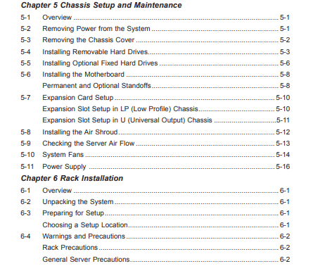
Within this user manual, content is divided thoughtfully with logical connections and relations. In Redish’s view, this manual has content divided by topic or task. “Topics are categories of information that are natural groupings for people’s questions” (Redish 162).
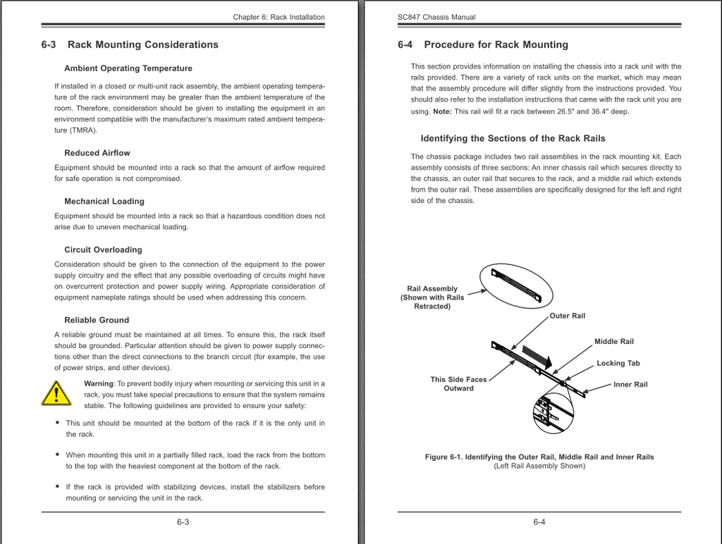
Content is given a fair amount of space on one page. There’s a lot of spacing that pad the content but there’s never “too much” or “too little”. Printing specific pages would not be an issue in terms of content length and is specifically designed with that in mind.
“If people want just one part of the information and have to print pages and pages to get it, they waste ink, paper, and time. That’s frustrating. If you break the information into very short pieces and people have to print several web pages in succession to get what they need, that’s also frustrating” (Redish 177).
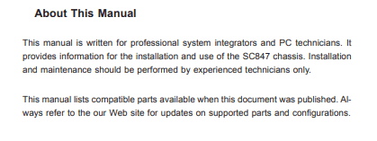
Redish does not recommend PDFs in general. However, PDFs are optimized for the printed page and usually comes from paper documents. The information for a server chassis is dense and requires a niche professional audience who would most likely be technically savvy enough to use a PDF reader or would need to print out this document. There’s a reason most computer hardware manuals require downloading a PDF; because it’s most likely an officially printed document that was scanned and is intended to be printed for usage.
PROSE STYLE
Approaching server hardware is intimidating. The initial expectation is complexity and absurd language and technical jargon. To the surprise of many, this technically dense hardware has a user manual that is really accessible and easy to understand. It is to the benefit of the writer and the readers to have clear and simple instructions and information to takeaway efficiently for a subject like this. There is no point in having unnecessary language and layers of depth for relatively simple steps and information.
Redish (188) has seven guidelines that help writers and content creators to converse successfully with readers to understand the content you’re providing.
- Give people only what they need.
- Cut! Cut! Cut! And cut again!
- Think “bite, snack, meal.”
- Start with your key message.
- Layer information.
- Break down walls of words.
- Plan to share and engage through social media.
Guidelines 1, 2, 4, 5 and 6 are utilized when discussing the SC847 Chassis Manual. Information and topics are discussed with brevity in this manual. There is never any excess wording or unintentional jargon that a layman wouldn’t be able to follow. The content is made so only the information necessary is provided to reduce on inefficient reading through redundant language or discussion. I am sure that a number of revisions were made because there is a complete lack of verbiage. The headings are the key message that get expanded upon. Information is layered within the content whenever the information would be necessary and helpful to know. Word walls are heavily avoided and are replaced with brief sentences or short paragraphs.
DESIGN
As a user manual for server equipment in a professional setting, the overall design does not try to appeal to readers through bright colors, visually engaging page elements, or anything that would visually detract from the information provided. The manual is a PDF that is meant to be printed or viewed as a document solely for information rather than an engaging document of-sorts.
Despite the lack of heavy color usage, this document retains general rules of color and keeps in mind the guidelines to have a clean and effective design.
Redish (101) has four guidelines when it comes to color:
- Work with your brand colors.
- Use light on dark sparingly.
- Keep the background clear.
- Keep the contrast high.
Despite not used often throughout the document, the first rule of using brand colors is used in conjunction with the second for some illustrations. The usage of “light on dark” is only used for illustrations when it is effective in visually labelling.
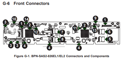

Notice how the arrows are green; I assume that it’s in relation to SuperMicro’s logo despite the difference in contrast. By being a black on white (black text on white background) document, the contrast is high and the background is clear. Both of those guidelines in conjunction make the text and illustrations very easy to read without being obscured by design elements.
The manual does a wonderful job at using space for the sake of clarity throughout the document. Redish has six guidelines for space which include:
- Create consistent patterns.
- Align elements on a grid.
- Keep active space in your content.
- Beware of false bottoms.
- Don’t let headings float.
- Don’t center text.
All six of these guidelines are met in this document and used consistently throughout.
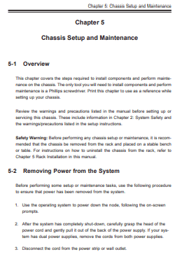
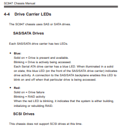
There is a consistent structure and pattern in the way that the content is laid out which helps readers gain confidence throughout the document for a logical and easy to comprehend page layout. According to Redish, “We are faster at understanding how the page is designed and at finding the specific part we need if the patterns are obvious and consistent across pages” (104).
The content is clearly aligned to a grid of-sorts in the document. It’s one of the most effective patterns for readers because it enforces an understanding that content can only start and end in a specific way. Therefore, there’s a lack of clutter or inconsistent understanding in the content layout allowing for an ease of reading and comprehension. “When people complain that a site is “cluttered” or “too busy” or “hard to use,” they are often reacting to pages where elements are not lined up well” (105).
Active space and passive space are kept in mind and thoroughly used throughout the manual. There is never a time when there is “too little active space” which cramps information and makes reading the content illegible. Passive space is consistent and used to frame the content allowing for content to not compete for space on the page. Redish’s suggestions for creating useful active spaces are all utilized (107).
• breaking the text into small chunks
• using lots of headings
• keeping paragraphs short and putting space between them
• turning sentences into more visual forms, like lists and tables
• putting space into lists
• including pictures and other graphics with a little space around them
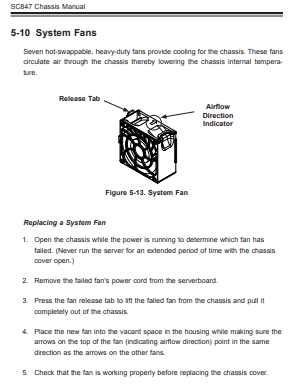
False bottoms do not exist in this document. There will always be a clear header that suggests a section has ended and begun anew. Headings do not float as there is a clear distinction in spacing and indentation by the structure of the document that helps create visual sections for headings and content. The majority of the content’s text is not centered- outside of the titles and illustrations- there is a consistent left-align for lists, paragraphs, etc.
As much as the color and space matter for some documents, the typography is an important aspect of this user manual due to how it is the main form of content and delivering information. The text needs to be legible and follow guidelines that make reading not a visual hassle. Thankfully, like the other aspects of this manual- I think that SuperMicro does a wonderful job with the typography. Redish (113) has six guidelines for typography including:
- Set a legible sans serif font as the default.
- Make the default text size legible for your visitors.
- Set a medium line length as the default.
- Don’t write in all capitals.
- Underline only links.
- Use italics sparingly
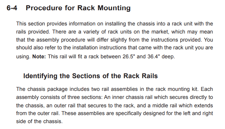
This user manual features the usage of a legible sans serif font that displays a modern and visually clean reading experience. The default text size is sufficient and easily legible with the amount of spacing and contrast mentioned prior. A median line length is featured where paragraphs and sentences will word-wrap to consistent points. There are little to no examples where content is written in all capitals. The usage of links and italics are both unseen with rarity and are used sparingly.
ILLUSTRATIONS
Working with the computer hardware, it is very difficult to follow the directions without having a visual reference. For a user manual on computer parts, it is necessary to have useful illustrations and graphics that will visually work alongside the content to make for an effective step-by-step guide.
Redish (362) mentions five purposes that illustrations can serve:
• Exact item: What do customers want to see?
• Self-service: What helps people help themselves?
• Process: Will pictures make words memorable?
• Charts, graphs, maps: Do they help site visitors get my message?
• Mood: Which pictures support the conversation?
Outside of the fifth purpose, mood, SuperMicro addresses the purpose of self-service, process, and “charts, graphs, maps”.
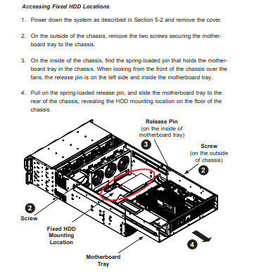
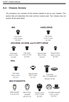
Alongside text instructions, there are a number of illustrations that help users visualize steps and “help users help themselves” in the form of self service and “process”. These visuals make processing concepts and steps as a useful reference beyond text. Especially in regards to the topic of a server case, these visuals are necessary and vital for users to make connections with the content.
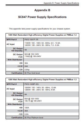
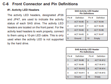
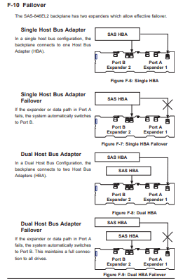
There are a number of charts, graphs, and maps that are utilized to help visually contain and show useful information. There are benefits to having illustrations layout information like the examples above- representing this information in text make processing and digesting the content a struggle. It is easier to understand and comprehend something with a visual relationship rather than trying to guess and figure out on one’s own conceptualization.
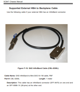
Redish has seven guidelines for illustrations but in the case of a user manual, we’ll specifically talk about a few. The first rule is “Don’t make people wonder what or why” (354). The illustrations are clear in this user manual with their relationships alongside the content and are self-explanatory given headings descriptions. The second rule is “Choose an appropriate size” (355). The two rules include not letting large pictures push content down too far, and making sure small images are clear. The user manual succeeds in not having pictures take up entire pages alongside having clarity for all illustrations. The illustrations provided are simple, comprehensible, and always relevant.
CONCLUSION
Overall, this tutorial has displayed how content, design, and illustration all work together to effectively and efficiently deliver information to readers. Perhaps to my own lack of awareness, I could not pinpoint any flaws or weaknesses that stood out in the content (writing), design, nor illustrations. Given the subject material, the documentation and amount of information provided was delivered in an approachable and comprehensive way that made learning and searching for the information I was looking for nontrivial. Content, design, and illustrations all rely on each other to effectively reach the audience with the writer’s messages and intent.
The most important foundation for this document is most likely the design. The design is cohesive, clean, and made the content and illustrations much more effective because of how minimalistic everything was in cohesion. Content was inherently put on the forefront due to how things were framed and logically laid out. The second most important aspect is most likely the content. The brevity and clear communication of ideas and language made reading much less of a chore and finding specific information was made easy due to efficient and effective headlines alongside writing. Illustrations acted as great supplementary forms of information that could contextual and inform in a manner that text would be unable to accurately portraying nor discussing.
I learned from this in-depth critique of a professional tutorial that there are layers of perspectives that need to be taken account of to best benefit readers and writers to the extent of language, visuals, and design. To effectively create a tutorial, the writer must make the experience of reading as logical, coherent, and efficient as possible. Doing so requires planning, structuring, and organizing all aspects of the tutorial. Once all that is done, content must be converted to be as useful in terms of language alongside the design to make the content itself easier to consume. The tutorial genre is all about efficiency and effectiveness and achieving both of those things is a difficult, time consuming, and a multifaceted area of writing.